Explained: how to plot the prediction quality metrics with AlphaFold2

In a previous blog post, we discussed the importance of AlphaFold2 (as well as other, deep-learning based methods) to accelerate the process of drug discovery by predicting the 3-dimensional structure of proteins and protein complexes. BioStrand provides a pipeline integrating the standard AlphaFold2 workflow, as well as additional post-processing workflows, all in a simple-to-run and scalable package. We will now discuss the method used for extraction of prediction evaluation metrics. After a successful AlphaFold2 run, you should have several files in the output repository. Note that depending on the type of predictions (default, monomer_ptm, multimer), the naming can change a bit.
<target_name>/features.pklranked_{0,1,2,3,4}.pdbranking_debug.jsonrelaxed_model_{1,2,3,4,5}_pred_0.pdbresult_model_{1,2,3,4,5}_pred_0.pkltimings.jsonunrelaxed_model_{1,2,3,4,5}_pred_0.pdbmsas/bfd_uniclust_hits.a3mmgnify_hits.stopdb70_hits.hhruniref90_hits.sto
The content of each file is as follows:
1. The unrelaxed_model_{*}_pred_0.pdb files contain the raw predictions of AlphaFold. Several models are predicted, and AlphaFold outputs the 5 best ones by default. These PDB files can be opened as any normal PDB files, with some differences. For example, the B-Factor calculated for structure determined experimentally has been replaced by another quality score from AlphaFold (LDDT).
2. The relaxed_model_{*}_pred_0.pdb files contain the refined predictions of AlphaFold. The corresponding unrelaxed models are fed to a force field algorithm, Amber, that computes the forces exerted on the sidechains of each residue, then computes displacements for each side chain atom. This process is done iteratively, until the energy of the whole molecule is minimised. The final configuration for each model is then stored in the relaxed_model_{*}_pred_0.pdb. This step is expected to generally improve the predictions and is set by default when AlphaFold runs.
3. The ranked_{*}.pdb files are redundant files which are sorted with respect to the quality of the models. They either correspond to the unrelaxed_model_{*}_pred_0.pdb files or relaxed_model_{*}_pred_0.pdb files, if the relaxation step is activated.
4. The ranking_debug.json files contain the quality scores of each model, as well as the ranking according to this score. The score varies from 100 (perfect confidence) to 0 (no confidence).
5. The msas/repository files contain the multiple sequence alignments computed in the pre-processing step of the AlphaFold run.
6. The timings.json files contain the run time for each step. As we can see in the following example, most of the run time is actually spent on feature extraction, which is done in the pre-processing step (mostly HHblits). The GPU actually only uses the predict_and_compile_model steps.
AlphaFold2 does not just output models, it also computes several confidence metrics about its predictions. Currently, these models are stored in .pkl files, and are not directly readable. They need to be “unserialized” in order to be readable and integrated in your workflow. This is how the features.pkl file can be opened with Python (3.7):

We can see that the object stored in features.pkl is a simple Python dictionary, with many keys such as sequence, msa, template_sequence, etc. The values associated with these keys are typical Numpy arrays of different dimensions. We will not discuss all of these features; they relate to the pre-processing step of AlphaFold2 (look-up + multiple sequences alignment). The confidence metrics are stored in the other .pkl files. We can open one to display its content.

Once again, the unpickled file contains a Python dictionary, and the different keys refer to different metrics. The metrics of most interest are the Predicted Aligned Error, as well as the predicted LDDT.
Note that when using the default settings, some of the metrics files displayed here will not appear, such as the Predicted Alignment Error, which is one of the metrics displayed in AlphaFoldDB entries. If you set --model_preset=monomer_ptm then you should have all the items listed above. The most important ones for assessing model quality are ‘plddt’ and ‘predicted_aligned_error’.
Assessing quality of model prediction
First, let’s have a look at a random entry in AlphaFoldDB.
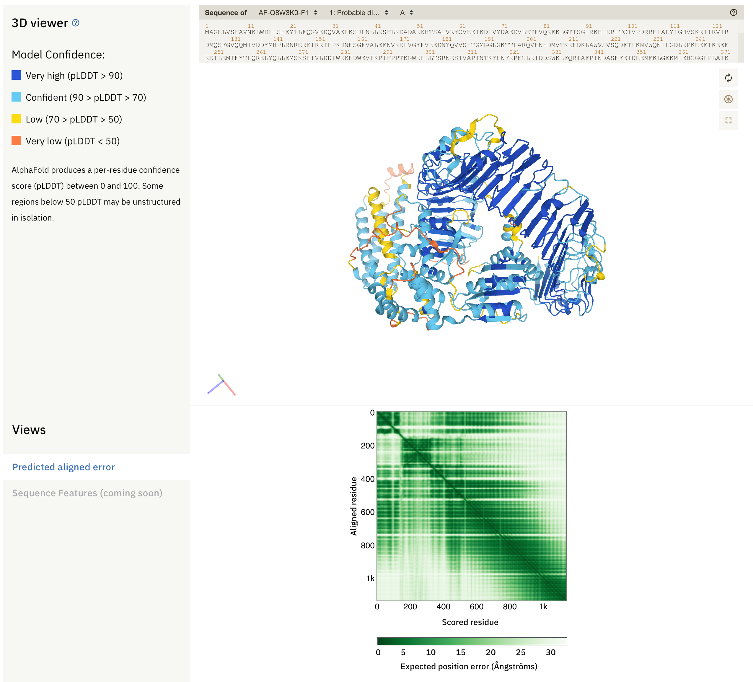
Fig. 1 - An entry in AlphaFoldDB
At the top, we see sequence(s) of the protein (complex), the 3D model with secondary structure, and the predicted alignment error plot (PAE). The colours in the model reflect the local confidence of the model, as given by the scale in the upper left side: dark blue regions have large confidence (pLDDT > 90) and orange regions have low confidence (pLDDT < 50). pLDDT corresponds to the model’s prediction of its score on the local Distance Difference Test (lDDT-Cα), and is a measure of local accuracy. This metric replaces the B-Factor found in structural models built from empirical methods. Low confidence score may be due to different reasons:
1. The corresponding sub-sequence may not have a significant amount of homologs in the training data.
2. The corresponding area may be represented in the training data, but the conformation is not fixed: it can be an intrinsically disordered region.
Below the protein model is the PAE plot, which identifies, in a pairwise fashion, the absolute error (Ångströms) of relative position between residues. In the colour scale of AlphaFoldDB, dark green correspond to 0 Å, whereas larger errors are coloured in white. Along the diagonal of the heat map, most elements are expected to be close to 0 Å. Well-defined blocks represent a domain of high confidence. A very good model would display a complete dark green heat map. In the example above, we see that this is not the case for the majority of the model. If you try to predict the fold of two domains (by setting --model_preset=multimer), you can end up with the following heat-map:
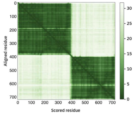
Fig. 2 - A PAE plot featuring two domains with low conformation confidence
In this case, two domains have been well predicted individually, however their relative positions are not well defined.
While these plots are available in AlphaFoldDB, the current version of AlphaFold2 (2.2.2) does not provide them right away. Rather, the user must plot them from the provided description above. While the LENSai pipeline still outputs them automatically, we will now describe how it is done using Python.
Plotting from your own AlphaFold output using Python
The first step is to load all of the dictionaries stored in .pkl files. This can be done using the following Python script (adapted from this Python script):
import osimport globimport pickleimport jsonimport numpy as npimport matplotlib.pyplot as pltclass ARG:def __init__(self, repo):self.input_dir = repoself.output_dir = repoself.name = reporepo = ['RBD_SARS-CoV-2'] # This is a list of all output repositoriesfor r in repo:args = ARG(r)with open(os.path.join(r, "ranking_debug.json"), 'r') as f:ranking_dict = json.load(f)feature_dict = pickle.load(open(f'{args.input_dir}/features.pkl','rb'))is_multimer = ('result_model_1_multimer_v2_pred_0.pkl' in [os.path.basename(f) for f in os.listdir(path=args.input_dir)])if is_multimer==False:model_dicts = [pickle.load(open(f'{args.input_dir}/result_model_{f}{"_multimer_v2" if is_multimer else ""}{"_ptm" if is_multimer==False else ""}_pred_0.pkl','rb'))for f in range(1,6)]else:model_dicts = [pickle.load(open(f'{args.input_dir}/result_model_{f}{"_multimer_v2" if is_multimer else ""}{"_ptm" if is_multimer==False else ""}_pred_{g}.pkl','rb'))for f in range(1,6) for g in range(5)]
In lines 1-7, a few libraries are imported to deal with file paths, being able to manipulate json objects, Numpy objects, and plot the figures using the matplotlib library.
In lines 8-12 the ARG class is defined, whose purpose is to store the input repository, output repository, and name of the output files. For the sake of clarity, we set all of these names to the same value, which will be the name of the output repositories.
In line 14, the names of the output repositories are set and stored in a list. We expect these repositories to be in the same directory as the script/notebook.
Finally, in lines 16-30, the script iterates over the repositories of files to load them as a list of dictionaries, which can then be used for plotting.
To plot the metrics, we the define two functions:
def get_pae_plddt(model_dicts):out = {}for i,d in enumerate(model_dicts):out[f'model_{i+1}'] = {'plddt': d['plddt'],'pae':d['predicted_aligned_error']}return outdef generate_output_images(feature_dict, model_dicts, ranking_dict,out_dir, name, pae_plddt_per_model):msa = feature_dict['msa']seqid = (np.array(msa[0] == msa).mean(-1))seqid_sort = seqid.argsort()non_gaps = (msa != 21).astype(float)non_gaps[non_gaps == 0] = np.nanfinal = non_gaps[seqid_sort] * seqid[seqid_sort, None]###################### PLOT MSA WITH COVERAGE ####################plt.figure(figsize=(14, 4), dpi=100)plt.subplot(1, 2, 1)plt.title(f"Sequence coverage ({name})")plt.imshow(final,interpolation='nearest', aspect='auto',cmap="rainbow_r", vmin=0, vmax=1, origin='lower')plt.plot((msa != 21).sum(0), color='black')plt.xlim(-0.5, msa.shape[1] - 0.5)plt.ylim(-0.5, msa.shape[0] - 0.5)plt.colorbar(label="Sequence identity to query", )plt.xlabel("Positions")plt.ylabel("Sequences")######################################################################################## PLOT LDDT PER POSITION ####################plt.subplot(1, 2, 2)plt.title(f"Predicted LDDT per position ({name})")s = 0for model_name, value in pae_plddt_per_model.items():plt.plot(value["plddt"],label=f"{model_name},plddts: {round(list(ranking_dict['plddts'].values())[s], 6)}")s += 1plt.legend()plt.ylim(0, 100)plt.ylabel("Predicted LDDT")plt.xlabel("Positions")plt.savefig(f"{out_dir}/{name+('_' if name else '')}coverage_LDDT.pdf")################################################################################### PLOT THE PREDICTED ALIGNED ERROR################num_models = len(model_dicts)plt.figure(figsize=(3 * num_models, 2), dpi=100)for n, (model_name, value) in enumerate(pae_plddt_per_model.items()):plt.subplot(1, num_models, n + 1)plt.title(model_name)plt.imshow(value["pae"], label=model_name, cmap="bwr", vmin=0, vmax=30)plt.colorbar()plt.savefig(f"{out_dir}/{name+('_' if name else '')}PAE.pdf")##################################################################
The first function (lines 1-6) will extract the relevant metrics, whereas the second (lines 8-65) will plot 3 different charts and save them in each of the output repositories. Then, we can call these functions and feed them the dictionaries to get the different plots.
pae_plddt_per_model = get_pae_plddt(model_dicts)generate_output_images(feature_dict, model_dicts, ranking_dict,args.output_dir if args.output_dir else args.input_dir,args.name, pae_plddt_per_model)
Let’s have a look at the plot extracted from an example (here, the receptor binding domain of SARS-CoV-2).
Multiple-Sequence Alignment (MSA)
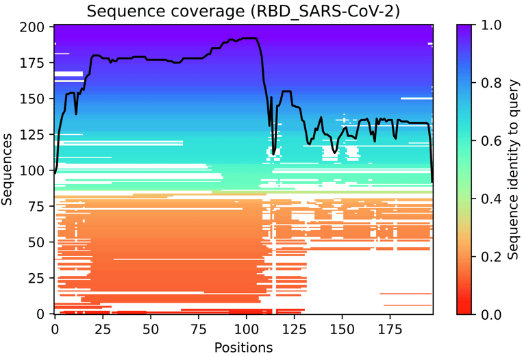
Fig. 3 - The multiple sequence alignment summarised as a heatmap
This heat-map representation of the MSA indicates all sequences mapped to the input sequences. The colour scale indicates the identity score, and sequences are ordered from top (largest identity) to bottom (lowest identity). White regions are not covered, which occurs with sub-sequence entries in the database. The black line qualifies the relative coverage of the sequence with respect to the total number of aligned sequences.
PLDDT plot
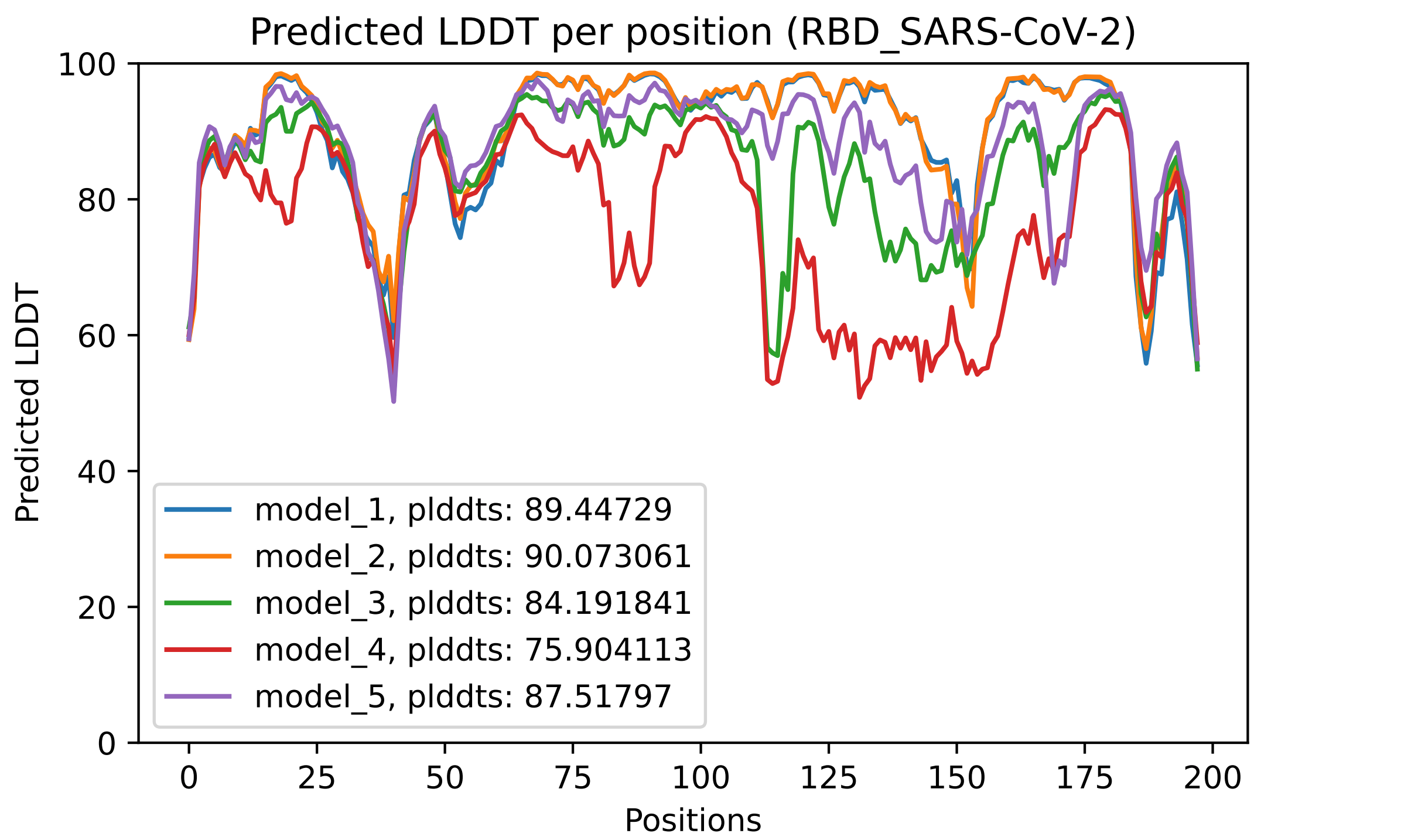
Fig. 4 - The predicted LDDT per residue for the 5 models obtained after an AlphaFold2 job
This plot displays the predicted LDDT per residue position. Here is what the AlphaFold developers report about this metric:
· Regions with pLDDT > 90 are expected to be modelled to high accuracy. These should be suitable for any application that benefits from high accuracy (e.g. characterising binding sites).
· Regions with pLDDT between 70 and 90 are expected to be modelled well (a generally good backbone prediction).
· Regions with pLDDT between 50 and 70 are low confidence and should be treated with caution.
· The 3D coordinates of regions with pLDDT < 50 often have a ribbon-like appearance and should not be interpreted. We show in our paper that pLDDT < 50 is a reasonably strong predictor of disorder, i.e., it suggests such a region is either unstructured in physiological conditions or only structured as part of a complex.
· Structured domains with many inter-residue contacts are likely to be more reliable than extended linkers or isolated long helices.
· Unphysical bond lengths and clashes do not usually appear in confident regions. Any part of a structure with several of these should be disregarded. (from https://alphafold.ebi.ac.uk/faq)
In the predicted model PDB files, the predicted LDDT per residue replace the traditional B-Factor reported for empirically derived models, even though in most softwares for visualization, it is still referred to as the B-Factor.
PAE plot

Fig. 5 - The predicted PAE plot for the 5 models obtained after an AlphaFold2 job
These heat maps are provided for each final model and show the predicted alignment error between each residue in the model. The colour scale contains three colours to further accentuate the contrast between the high confidence regions and the low confidence regions. With a quick glance, we can see that model_4 is the one where the errors are the largest, followed by model 3. This is reflected in the ranking of the models in the ranking_debug.json file. These scores are also displayed in the LDDT plot, in the legend. We can see there that model_2, with a pLDDTs score of 90.073, is the model with the smallest errors (also, you can see in the PAE plot that this one contains less red area than the other models).
Comparing the 3D models with molecular visualisation tools
PDB models can be visualised with different tools:
· ChimeraX: https://www.cgl.ucsf.edu/chimerax/
· PyMOL: https://pymol.org/2/
· YASARA view: http://www.yasara.org/viewdl.htm
· …
In this example, we will use YASARA view, which is quite popular amongst researchers in academia, and features integration with the FoldX to perform force field calculations. Let’s open all the ranked_{0,1,2,3,4}.pdb files from the example of the notebook: File > Load > PDB file.
We will have the following:
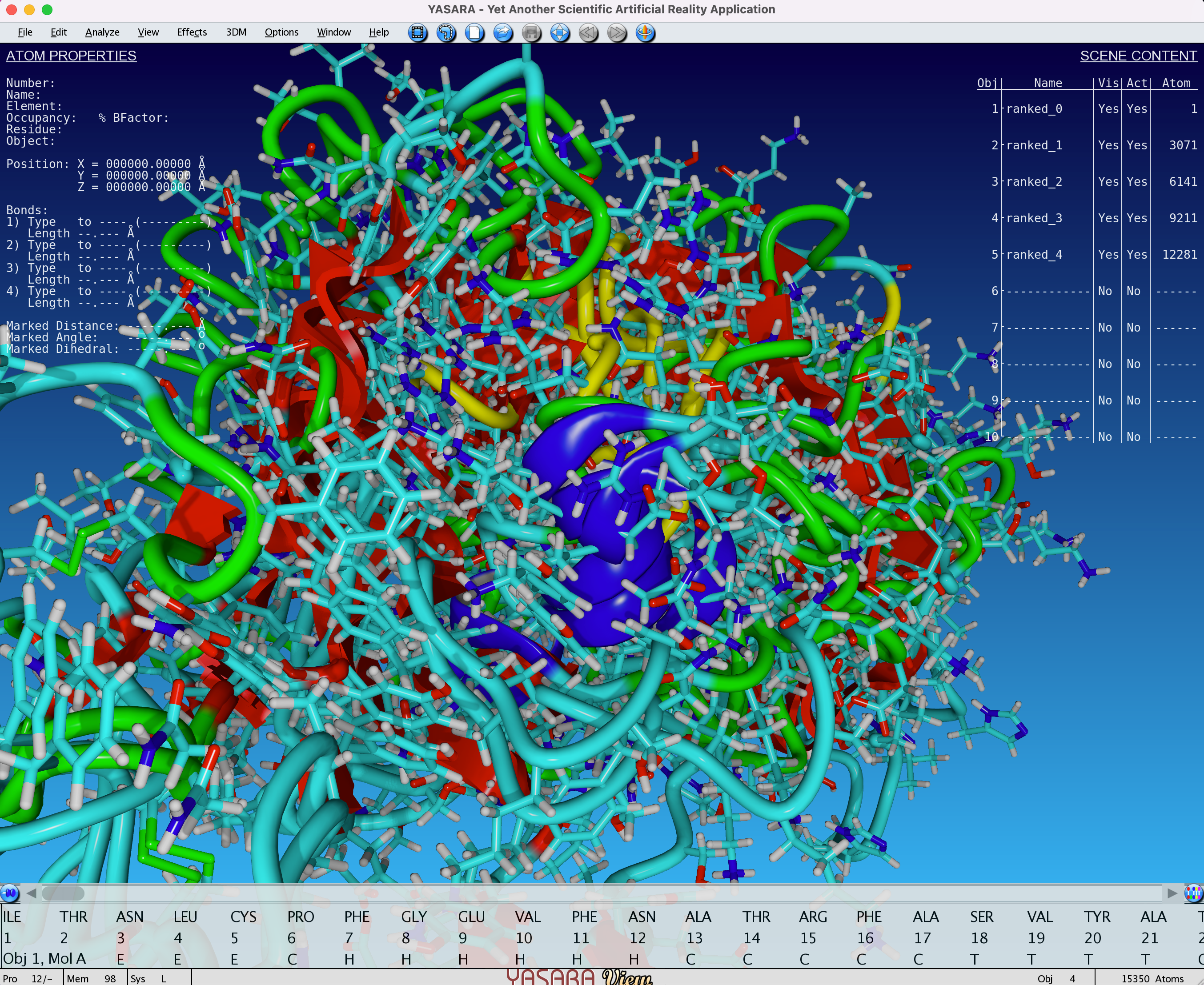
Fig. 6 - Visualisation (with YASARA View) of 5 unaligned models obtained after an AlphaFold2 job
In this example, we see that all 5 models are superimposed and unaligned. This is because the basis for each model can be different. You can align all of the models by doing the following: Analyze > Align > Multiple, based on structure, Objects with MUSTANG. You can also choose a single reference on which to align all the other models.
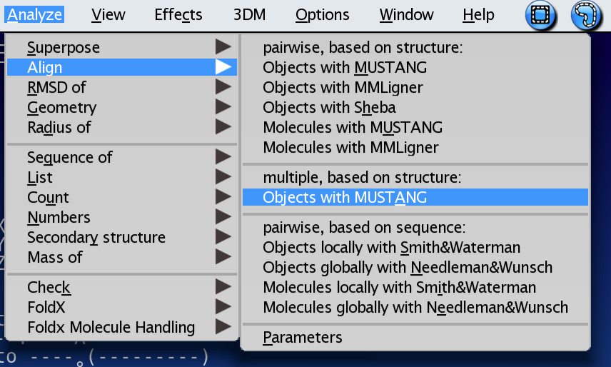
Fig. 7 - Structural alignment algorithms provided with YASARA View
Once this is done, all the models will be superimposed. You can choose to give them different color by clicking on the Object name (model name) on the upper right side of the UI (ranked_0, ranked_1, …). Then right click and choose Color. If desired, you can colour all the model with the B-Factor, which corresponds to the LDDT score in this case. Doing so, will result in something that looks like this:
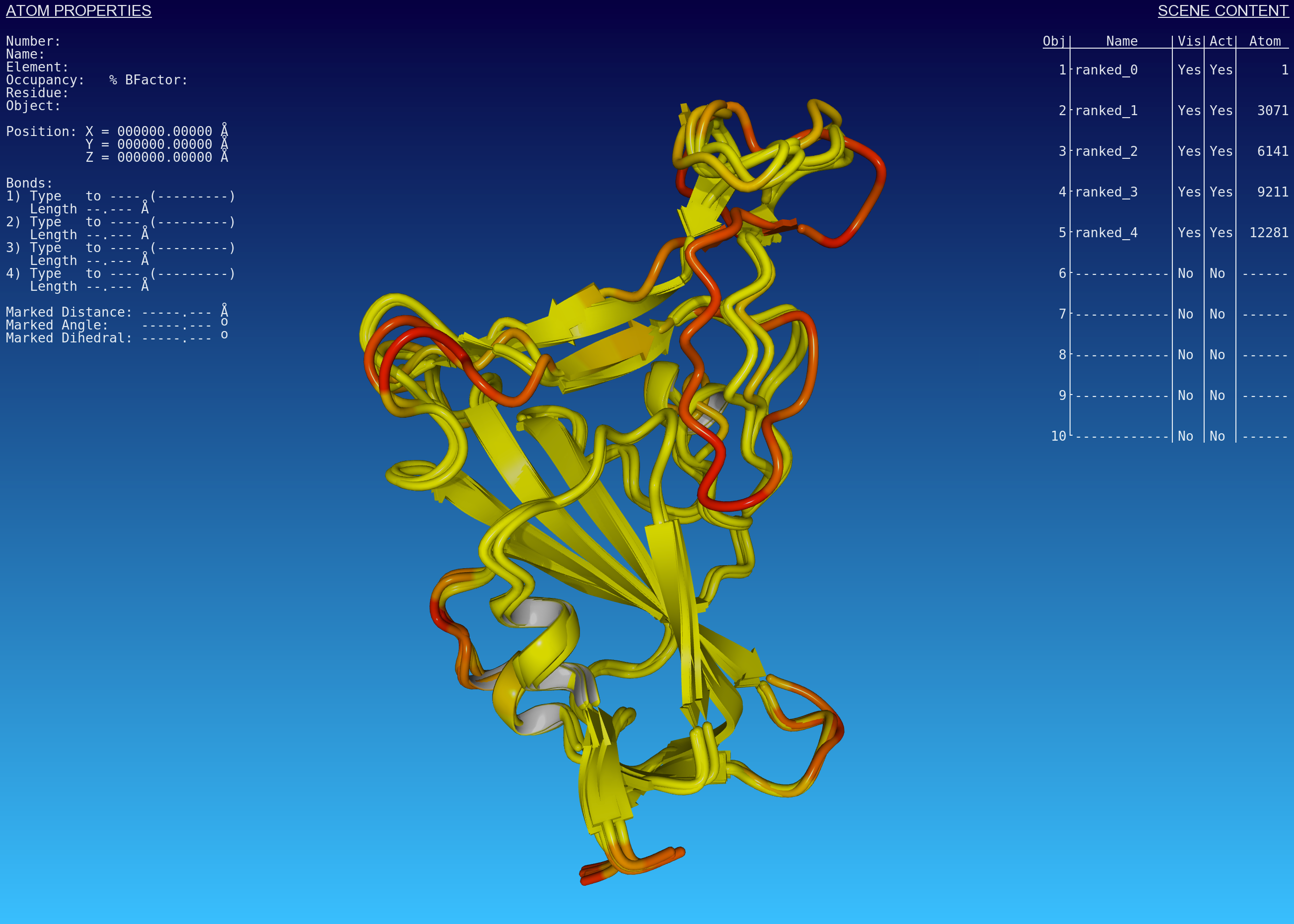
Fig. 8 Predicted AlphaFold2 models after structural alignment. The colour scheme is indexed on the B-Factor value (or rather, the predicted LDDT score per residue)
Here you see that all of the regions coloured in yellow (high confidence) tend to overlap quite well. On the other side, the regions coloured in red (low confidence) are less likely to overlap. Coincidentally, these regions are also predicted as loops, and can potentially correspond to disordered regions, unstructured in physiological conditions or only structured as part of a complex. However, this cannot be determined solely from the predictions of AlphaFold, it is important to remain cautious when interpreting results.
Conclusions
We just described how to plot the relevant prediction quality metrics of a standard AlphaFold2 job. These are all integrated within the LENSai pipeline, putting all of the relevant charts within an easy-to-read report. This pipeline will also be integrated within a larger ecosystem of pipelines of structural bioinformatics for which BioStrand has secured a new VLAIO research grant to accelerate the development of a knowledge base surrounding protein structures and metadata integration.
Subscribe to our Blog and get new articles right after publication into your inbox.
Subscribe to our blog:


